
Your site probably works fine on a phone. Buttons tap, text shows up, images load. Nothing looks obviously broken.
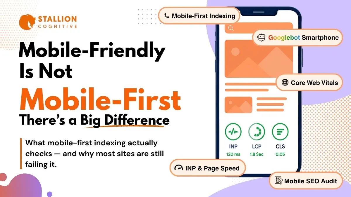
But Google doesn't just look at whether your site works on a phone. Its smartphone bot crawls your mobile site first and uses that version as the sole basis for your ranking. If anything is missing from the mobile side, it effectively disappears and becomes invisible to search engines.
That distinction between "works on mobile" and "actually optimized for mobile-first indexing" is the core of mobile SEO in 2026, and it trips up more site owners than you'd think. We audit sites constantly where the mobile experience looks perfectly fine from a user's perspective, but the crawl data tells a completely different story. Content that's hidden behind toggles. Structured data that only exists on the desktop template. Internal links that Googlebot can't reach because they're buried inside a hamburger menu. These are the kinds of issues that drain rankings over time without anyone noticing.
What Is Mobile-First Indexing and Why Does It Still Trip People Up?
Mobile-first indexing means Google relies on the mobile version of your site for its crawling, indexing, and ranking decisions. If a piece of content appears on your desktop page but not on mobile, Google won't take it into account.
The full transition wrapped up in July 2024 after years of gradual rollout. Every website goes through it now. No exceptions.
Simple enough as a concept. But mobile SEO goes wrong in the implementation, and that's where it gets messy.
How Googlebot Smartphone Actually Crawls Your Pages
Google's smartphone crawler renders each page the way Chrome would on a mobile device, JavaScript and all. That rendering process uses significantly more server resources per page than a basic text crawl.
But the bigger issue for most sites isn't crawl budget. It's content parity.
Content parity is whether the mobile version of your site serves the same content as desktop. A surprising number of sites have gaps here that nobody on the team is aware of.
| Issue | What Happens | How It Hurts Rankings |
| Hidden mobile content | Text or images sit behind "read more" toggles that Googlebot never clicks | That content drops out of the index completely |
| Blocked resources | CSS or JS files are blocked via robots.txt on the mobile version | The page renders broken for Googlebot, even if it looks fine to visitors |
| Mismatched meta tags | Mobile template carries a noindex tag that the desktop version doesn't have | Google follows the mobile directive and pulls the page from search |
| Missing structured data | JSON-LD markup exists on desktop but somebody removed it from the mobile template | Rich snippets stop showing up, click-through rates drop |
The problem is none of this shows up when you browse your own site on a phone. Everything looks normal. Googlebot, however, is seeing something very different.
Warning signs to watch for:
- Desktop-only widgets: Testimonial carousels, tabbed content blocks, sidebar elements the mobile template doesn't render. Very common on page-builder sites.
- Tap-loaded content: Accordion sections where text only shows after a tap. Googlebot won't tap.
- Stripped galleries: Product photos or infographics removed from mobile to speed things up. Google can't index what it doesn't receive.
How Do You Audit for Mobile-First Indexing Now That Google Killed Its Own Tool?
Google retired its Mobile-Friendly Test tool in late 2023. The reasoning was that mobile-friendliness should be a baseline expectation, not something that needs its own tool.
That's reasonable. But it does mean you need different tools to check how your mobile site looks to Google's crawler.
The Three Tools That Make Up Your Audit Stack
1. Lighthouse in Chrome DevTools: Right-click any page, select Inspect, open Lighthouse tab, set to Mobile. The 0-100 scores are useful, but the real value is in the specific flags it raises. Missing image dimensions, tap targets too close together, render-blocking scripts, viewport issues.
2. Google Search Console: The dedicated Mobile Usability report is gone. The Page Experience section still breaks Core Web Vitals out by device type, though. And the URL Inspection tool shows you exactly how Googlebot renders a given page, which is extremely helpful for catching content parity issues you wouldn't spot otherwise.
3. Screaming Frog: Set the user agent to "Googlebot Smartphone" and crawl your full site. Do a second crawl as Googlebot Desktop. Compare the two exports. You're looking for differences in word count per page, internal link count, structured data presence, and meta directives.
A Practical Audit Sequence
Here's the order that tends to catch the most problems fastest:
- Pull mobile CWV data from Search Console: Filter for "poor" URLs and focus on pages actually getting traffic
- Lighthouse your top 10 landing pages: Flag anything scoring below 70 on performance
- Dual crawl in Screaming Frog: Compare smartphone vs desktop results to find content parity gaps
- Benchmark mobile load times: Google's "good" LCP threshold is 2.5 seconds, but sites holding strong positions come in well under 2
That covers roughly nine out of ten mobile SEO issues tied to indexing. The remaining edge cases usually come down to JavaScript rendering.
Why Do Mobile Core Web Vitals Lag So Far Behind Desktop Scores?
Most mobile sites still fail at least one Core Web Vital. Desktop pass rates are considerably higher across the board.
That gap is one of the biggest untapped opportunities in mobile SEO right now, because most competitors aren't fixing it either.
Google tracks three metrics, and each one causes different problems on mobile.
What INP, LCP, and CLS Look Like on Mobile
| Metric | What It Measures | "Good" Threshold | Where Mobile Sites Usually Fail |
| LCP (Largest Contentful Paint) | How fast the biggest visible element loads | Under 2.5 seconds | Oversized hero images struggling on cellular connections |
| INP (Interaction to Next Paint) | How quickly the page responds when you tap or click something | Under 200 milliseconds | Too much JavaScript clogging up the main thread |
| CLS (Cumulative Layout Shift) | How much the page layout shifts and jumps while loading | Under 0.1 | Late-loading ads, images with no set dimensions, consent banners pushing content around |
INP replaced First Input Delay in March 2024. It's a harder benchmark because FID only measures the first interaction on the page, while INP monitors every tap and click for the entire visit.
- Most INP failures on mobile trace back to too much JavaScript on the main thread. A user taps a button and the browser can't respond because it's still processing a third-party analytics script. Removing five to ten unnecessary scripts from that page is often enough to fix it.
- LCP is more of a bandwidth problem. Hero images take longer to load on cellular connections. The sites that hold strong mobile rankings tend to keep their LCP well below the 2.5-second mark.
- CLS is usually the easiest to fix. Images without explicit width and height, ads that push content around after loading, cookie banners that shift things out of position. These are all straightforward once you identify them.
And the reason it's worth caring about: according to Google's page speed research, each additional second of mobile load time increases bounce probability by roughly a third.
Which Mobile Page Speed Fixes Actually Produce Results?
There's a lot of mobile SEO speed advice out there. Most of it won't move the needle on rankings. The fixes that tend to actually make a difference come down to images and JavaScript.
Image Optimization (and How Lazy Loading Can Backfire on You)
Images cause more LCP failures on mobile than anything else.
- Switch to WebP or AVIF: A 250KB JPEG hero image drops to around 80-90KB in WebP with no visible quality loss. On a 4G connection, that can shave half a second off your LCP by itself.
- Preload your hero image with fetchpriority="high" in the <head>, but don't lazy-load it: Lazy loading tells the browser to wait until someone scrolls to that element. For the very element Google is measuring for LCP, that's counterproductive. We find this misconfiguration on roughly one in three WordPress sites.
- Lazy-load everything else below the fold: Gallery images, decorative graphics, background visuals. Just not anything in the initial viewport.
JavaScript Cleanup
Run Lighthouse on a typical WordPress site with a page builder and a few plugins. Look at the "Remove unused JavaScript" section. You'll usually find 300-500KB of JavaScript loading on every page, whether that page needs it or not.
Real examples from audits:
- WooCommerce cart scripts running on blog posts with no buy buttons
- A contact form plugin's full JS bundle loading on the homepage when the form only lives on the Contact page
- Multiple analytics scripts all doing overlapping tracking
- A chat widget initializing before anyone has scrolled past the headline
Conditional loading solves most of this. Serve scripts only on pages where they do something. Defer everything that's not needed for the initial render. Audit third-party scripts quarterly, because sites accumulate unused scripts without anyone keeping track.
For heavy embeds like YouTube (roughly 800KB on load), show a static thumbnail and load the actual player only when someone clicks. The same approach works for maps and social feeds.
How Does Responsive Design Fit Into Mobile SEO and Crawling Optimization?
Google recommends responsive design over separate m-dot mobile sites. That recommendation has become a standard expectation at this point.
Why Responsive Wins
Responsive serves the same HTML to every device and adjusts layout through CSS. One URL per page, one codebase, one pool of backlink authority.
Running a separate m.example.com creates two specific problems that responsive avoids:
- Canonical tag drift: two versions of every page means two sets of canonical tags that need to stay perfectly synchronized. When they fall out of sync, and they do more often than teams expect, Google gets confused about which version to rank.
- Split link equity: backlinks to desktop URLs don't pass authority to m-dot equivalents automatically. You end up building two link profiles instead of consolidating into one.
The Details That Still Cause Problems
Even with responsive design properly in place, a few things consistently trip up mobile-first indexing.
Structured data has to match on both versions: If the desktop has Article schema, FAQ markup, and Breadcrumb JSON-LD, mobile needs all of it too. We've seen sites lose rich snippets because someone stripped schema from the mobile template to save page weight. Not a trade-off that works in your favor.
Internal links behind taps may be invisible to Googlebot: Hamburger menus, collapsible nav, "see more" toggles, these can all hide links if they're not in the initial HTML. Every link your internal linking strategy relies on needs to be accessible without requiring a tap.
Viewport and touch targets: Set the viewport meta tag correctly on every page. Tap targets should be at least 48x48 pixels with spacing between them. Lighthouse still flags these on a lot of sites.
Do not forget to look into voice search readiness. Because most voice queries happen on mobile. Structuring content around conversational keywords helps both your AI Overview visibility and your overall mobile SEO performance.
What Happens If You Just Keep Ignoring This?
You will not get any dramatic penalty or notification. Nothing that would make you sit up and take notice right away.
What happens instead is gradual. Pages drift down in the SERPs. Competitors with faster, more complete mobile experiences take their place. Crawl budget gets wasted on slow-rendering pages, so new content sits in a queue for weeks. Mobile visitors leave a little faster because something about the experience doesn't quite feel right.
Mobile traffic is the majority of web visits now in nearly every industry. Yet mobile conversion rates still lag behind desktop for most businesses, and a big chunk of that gap comes from fixable optimization problems.
Mobile SEO isn't a one-time fix, either. Build it into how you manage the site:
- Every quarter: Full mobile audit. Dual crawl, content parity review, CWV check.
- Every month: Check the Page Experience report in Search Console for regressions.
- After every site change: Lighthouse your top pages within 48 hours. Doesn't matter if it's a plugin, a theme update, or a new script.
If you're not sure where the leaks are, reach out to the team for a mobile SEO audit and get a clear read on what needs work.
Frequently Asked Questions
Does mobile-first indexing mean Google ignores the desktop version of my site?
Not entirely. Google still runs a desktop crawler, but at this point it plays a secondary role. The smartphone bot makes all primary crawling, indexing, and ranking decisions. If content only exists on your desktop page, it won't help your search positions. Prioritize mobile.
Can persistent mobile speed issues lead to pages disappearing from search results?
Outright deindexing from speed alone is rare. What actually happens more often is that Googlebot uses up crawl budget rendering slow pages, which delays indexing of newer content. Over months, fewer of your pages end up appearing in search. The pages are technically still indexed, they're just not showing up.
How frequently should mobile Core Web Vitals be monitored?
Monthly through Search Console's Page Experience report catches most regressions. On top of that, run Lighthouse within 48 hours of any site change. Plugin updates tend to be the sneakiest cause of sudden CWV drops, so pay extra attention after those.
What's the most impactful single fix for a poor mobile LCP score?
Preload the hero image with fetchpriority="high" and convert it to WebP or AVIF. On pages where the hero is the LCP element, and that's most landing pages, this alone can cut half a second to a full second off the load time.
Is there any reason to still run AMP pages in 2026?
AMP lost its exclusive Top Stories carousel spot years ago. Adoption has been trending down since. Google treats AMP and non-AMP pages identically for indexing and ranking at this point. If your responsive site passes Core Web Vitals, keeping a parallel AMP version running is just extra maintenance cost for the same result.