
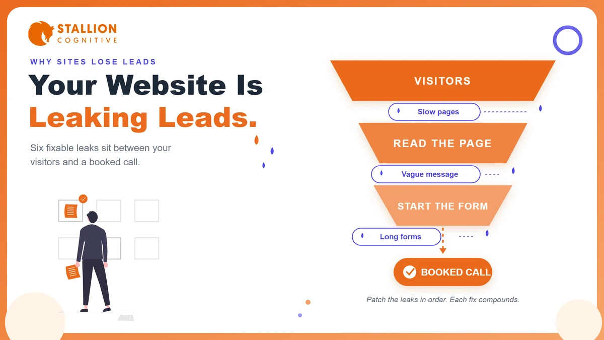
Your website gets visitors. The phone still isn't ringing the way it should.
That gap is rarely a traffic problem. We audit financial-firm websites every month, and the same pattern keeps showing up. The pages load slowly, the message takes too long to land, and the contact form asks for too much too soon.
A high-converting business website closes that gap on purpose. It answers fast, proves it deserves trust, and makes the next step feel small.
Below, we walk through the six places business sites leak leads, in the order we check them during an audit. Fix them in the same order, because each fix compounds the one before it.
Let's start with the diagnosis.
Why Is Your Website Not Converting Visitors Into Leads?
Most business websites fail to convert for one of six reasons. The pages load slowly, the message stays vague, the mobile experience breaks, trust signals run thin, the contact path adds friction, or AI answers now intercept the click. Every audit we run traces the leak back to at least one of these.
The good news? A leak you can name is a leak you can fix.
Start with the symptom you're already seeing and work backward. The table below maps the six most common ones to their usual cause.
| What you're seeing | The usual cause | Where to look |
|---|---|---|
| Visitors leave within seconds | Slow pages or weak hosting | Speed |
| People scroll but never click | A vague message above the fold | Message |
| Mobile bounce runs far above desktop | A desktop site squeezed onto phones | Mobile |
| Enquiries come from the wrong clients | Copy that speaks to everyone | Message and trust |
| Forms get opened but never sent | Too many fields, too much friction | The conversion path |
| Rankings held steady while clicks fell | AI summaries answering before the click | The AI layer |
One caution before you touch anything. Owners tend to jump straight to a redesign, and a full redesign is usually the most expensive way to solve what a two-hour fix could handle. Diagnose first, spend second.
Which row stung? Keep it in mind, because each section below takes one leak and shows what the fix looks like.
Speed Loses the Lead Before Your Pitch Loads
A slow website filters out impatient visitors before a single word gets read. And your best prospects are the impatient ones, because busy owners and executives won't wait for a hero image to render. Speed is the first thing we test in any audit, and the most common failure we find.
Google's own performance case studies put hard numbers on the link between website speed and conversion. When Vodafone improved its Largest Contentful Paint by 31%, sales rose 8%. The same Google page notes the BBC lost an extra 10% of readers for every additional second a page took to load.
Those are big brands. The math gets harsher for a twelve-person firm, where one lost enquiry might have been a five-figure client.
Google grades speed through three Core Web Vitals, and they're worth knowing by name.
| Metric | What it measures | Google's target |
|---|---|---|
| Largest Contentful Paint (LCP) | How long the main content takes to appear | 2.5 seconds or less |
| Interaction to Next Paint (INP) | How fast the page reacts when someone taps or clicks | Under 200 milliseconds |
| Cumulative Layout Shift (CLS) | How much the page jumps around while loading | 0.1 or less |
You don't need a developer to get a reading. Run your home page through a speed testing tool first, then pull the field data inside PageSpeed Insights to see what real visitors experience on real connections.
Four fixes cover most slow business sites.
- Oversized images: Compress and resize them, since a 4 MB hero photo is still the most common single cause we find.
- Cheap shared hosting: A slow server caps everything else, and upgrading often beats weeks of tuning.
- Plugin pileup: Every builder add-on loads its own scripts, so remove the ones doing nothing.
- No caching: Serve returning visitors a stored copy instead of rebuilding the page every time.
Fix speed before anything else on this list. Every other improvement gets measured only by the visitors who stayed.
Your Next Client Is Reading This on a Phone
Mobile is where first contact happens now. Someone hears your firm's name, pulls out a phone, and forms a judgment before they ever sit at a desk. If that first visit pinches, zooms, or hunts for a phone number, there's no second visit.
We see the same split across financial-firm sites again and again. Mobile brings the first visit. Desktop brings the return visit that fills in the form. Lose the first one and the second never happens.
Pick up your phone and test your own site right now. Check five things.
- Thumb reach: The main call to action sits where a thumb lands without stretching.
- Tap targets: Buttons and menu items are big enough to hit on the first try.
- Readable text: Nobody pinches to zoom, ever.
- Click-to-call: The phone number dials on tap instead of sitting there as decoration.
- Short forms: Fields stack in one column and the keyboard matches the field type.
A mobile-friendly website also feeds your rankings, since Google indexes the mobile version of your site first. The ranking case gets all the attention. The conversion case quietly costs firms more.
If your site passed all five checks, good. The next leak is harder to see from the inside.
Can a Stranger Tell What You Do in Five Seconds?
Show your home page to someone outside your industry for five seconds, then ask what you do and who it's for. If they can't answer both, your message is the leak. Visitors don't work to decode a value proposition. They leave and decode your competitor's instead.
The five-second test fails most often at the headline. Compare these two, both real patterns we see on advisory sites.
"Smart solutions for your financial future."
"Fee-only retirement planning for physicians and dentists."
The first could belong to any firm in any city. The second tells a physician she's found her advisor, and tells everyone else to keep moving, which is exactly what a headline is for.
Conversion-focused web design carries that clarity down the whole page. One idea per screen. Generous white space so the eye lands where you want it. A homepage structure that sorts visitors toward the service they need instead of describing the firm to itself.
Three copy rules do most of the work.
- Name the client in the headline: The profession, the vertical, or the situation you serve best.
- Make the subhead carry the outcome: What changes for them after they hire you.
- Give every page one job: A service page sells one service, and your landing page design decides whether ad spend pays off.
Specific copy repels the wrong visitor and converts the right one. That trade is always worth making.
The Trust Checks a Financial-Services Buyer Runs
Before anyone books a call with a firm that will touch their money, they verify. They look for real names, real credentials, recent reviews, and details that match what Google already told them. Website trust signals decide whether your visitor becomes an enquiry or quietly closes the tab.
Think about how you last chose a contractor or a specialist. You ran the same checks. Your prospects run them on you, and in financial services the bar sits higher because the cost of choosing wrong is bigger.
What the buyer looks for, in roughly the order they look.
- Real people: An About page with names, faces, and credentials, since stock photos read as evasion.
- Recent proof: Customer reviews from the last few months, because a wall of two-year-old praise raises its own question.
- Consistent details: The same address, phone, and wording your Google listing shows.
- Signs of life: A blog updated this quarter and a current copyright year in the footer.
- Compliance comfort: Disclosures where they belong, which clients of registered advisors notice more than most firms expect.
An outdated website undoes all of it at once. Visitors read a stale site as a stale practice, fair or unfair.
Trust builds quietly and cumulatively. A buyer will rarely tell you which missing element lost them.
Shorten the Path From Interest to Booked Call
Count the steps between "I'm interested" and "done" on your site. Every extra field, click, and decision sheds a share of your leads. The firms with the best website conversion rate make the next step tiny, obvious, and available from every page.
Here's the catch. Most contact pages were built to filter enquiries, with ten required fields doing the filtering. That approach worked when leads were plentiful. Now the same form filters out busy, qualified buyers who won't type their life story into a box.
Walk your own path as if you were a prospect, then tighten these four steps in order.
- Cut the form to three or four fields: Name, email, and what they need. You can qualify on the call.
- Make one action primary: A page with five equal buttons converts like a page with none, so let the call booking lead and everything else whisper.
- Say what happens next: "We reply within one business day" beats a bare Submit button, because silence after submission is where trust goes to die.
- Reply the same day: The lead you answer in an hour books a call. The one you answer on Thursday already called someone else.
Your contact page sets the tone for the whole relationship. Small changes stack, which is why we treat conversion rate work as tuning rather than surgery.
How Does AI Search Change What Converts?
AI answers now sit between you and part of your traffic. Fewer visitors click through to any site, including yours, but the ones who do have often been pre-sold by the answer that named your firm. The conversion job shifts from persuading cold readers to confirming warm ones.
The numbers behind that shift are public, and they're not small.
Pew Research found clicks on regular search results drop from 15% to 8% when an AI summary appears on the page.
That changes what your pages need to do, in two ways.
First, your pages need to be worth quoting. Engines lift clear, self-contained answers, so a page that opens with the point earns mentions while a page that warms up for three paragraphs gets skipped. The full process to get cited by AI runs deeper than one section can cover, but the habit starts with answer-first writing on every page you publish.
Second, the visitor who clicks through from an AI answer arrives warmer. They've already seen your name recommended, so they land closer to a decision and go straight for the trust checks from the last section. Give that visitor a fast page, a clear next step, and proof that matches whatever the answer said about you.
One caution for firms tempted to shortcut the work. Template copy is a big part of why firms that build a website with AI see pages published but never quoted. The tool ships something that reads fine and says nothing specific enough to lift.
- Quotable pages: Open every section with the answer, then explain.
- Warm landings: Match each page to the question the AI answered.
- Proof parity: Make sure what the visitor finds backs up what the answer claimed.
The AI layer rewards the same site the human buyer rewards. Clear, fast, and specific wins both audiences with one effort.
Fix the Leaks in Order
You don't need a new website to get more leads next quarter. Most firms need the one they already have to stop leaking.
Run the diagnostic table against your own site this week. Test the speed, hand the five-second test to a stranger, and count your form fields. Two or three of the fixes above usually sit within a day's work.
And if the audit turns up more than patches can solve, that's worth knowing too. Our website design work builds conversion-focused web design into the structure from day one, so the leaks never open in the first place. Start a conversation and bring your list.
What would one extra booked call a week be worth to your firm by December?
Frequently Asked Questions
What's a typical conversion rate for a professional-services website?
Most service-firm sites turn a low single-digit share of visitors into enquiries, and anything near double digits usually reflects strong-intent traffic. The number worth watching is your own trend after each fix rather than an industry benchmark built on unlike businesses.
Do pop-ups still work for lead capture?
Used sparingly, an exit-intent offer can add leads without hurting the experience. The damage comes from pop-ups that fire on arrival or cover mobile screens, which Google may treat as intrusive. Earn attention first, then make the offer.
How often should a business website be redesigned?
A structural redesign every four to six years tends to be enough when the site gets continuous small updates in between. Firms that touch nothing for five years pay for that pause in lost leads before they ever pay for the rebuild.
Does hosting choice affect conversions?
Through speed, uptime, and security, hosting sets the floor for everything else on this page. A weak server caps your Core Web Vitals no matter how well the site itself is built, so treat hosting as part of the conversion budget.
Should a firm publish pricing on its website?
Publishing at least a starting range tends to raise enquiry quality, because price-shocked prospects filter themselves out before the call. Firms that hide pricing often get more enquiries but close fewer, and compliance teams generally accept ranges with plain caveats.