
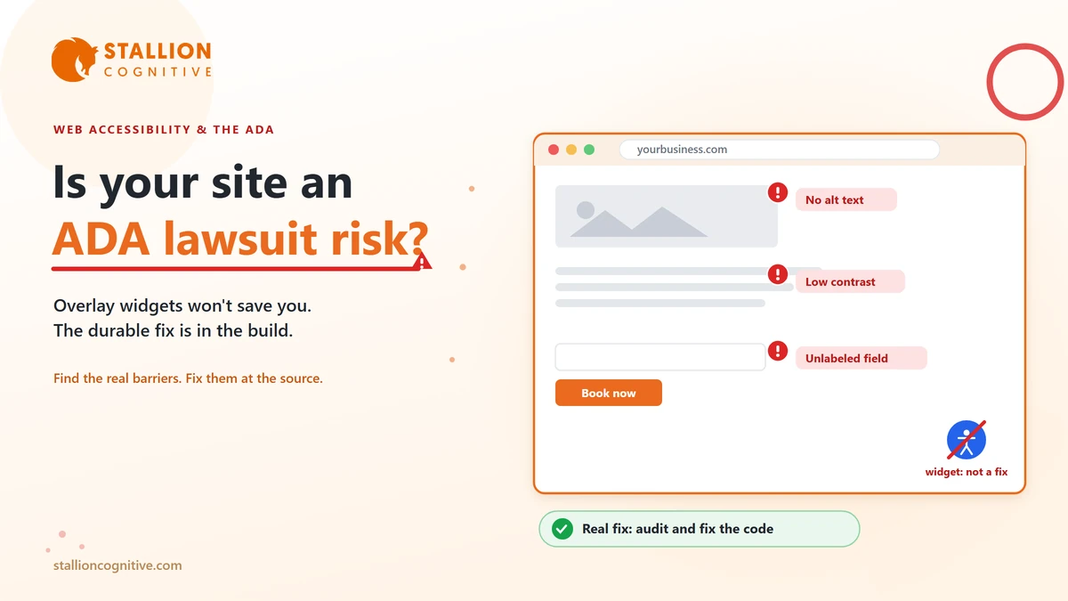
Most owners meet web accessibility the hard way. A letter shows up from a law firm, claiming the company website cannot be used by someone with a disability and breaks the Americans with Disabilities Act. Suddenly the question is no longer whether this matters. It is how much a settlement will run you.
You do not have to end up there. Web accessibility is a solvable problem, and the businesses that handle it early spend a fraction of what the ones waiting for a letter do.
We wrote this for the person who signs off on the website, rather than the developer who builds it. We audit sites for exactly these issues, so it stays practical. It covers why the lawsuits keep rising, what the rules actually ask of you, why the popular quick fixes fail, and how to check your own site. One caveat first. This is general guidance rather than legal advice, and a real threat belongs in front of an attorney.
Why Business Websites Are Getting Sued
Courts and regulators now agree the ADA reaches your website, and that agreement turned a slow trickle of complaints into a flood. For years people argued over whether a disability law written in 1990 applied to something as modern as a website. That argument is mostly over. The Department of Justice states in its web accessibility guidance that the ADA covers the goods and services a business offers online, the same way it covers a physical store.
Once that was settled, the filings followed. Thousands of accessibility lawsuits and demand letters now go out every year in the United States, and the count keeps climbing.
What catches owners off guard is who gets targeted. These cases rarely go after household names. A large share land on small and mid-size businesses that assume nobody is studying their site closely enough to sue. Plaintiff firms often work from lists, scanning hundreds of sites for the same handful of failures, so a small local shop is as easy to flag as a national chain.
A few patterns decide who gets hit.
- Sites that sell or book online: An online store, a scheduler, or a quote form is a place of business a customer has to be able to use, and these draw the most claims.
- Sites with obvious, testable failures: Missing image descriptions, forms that trap a screen reader, and low-contrast text all get spotted at scale.
- Sites in states with heavy filing activity: New York, Florida, and California see the most cases, and a business anywhere can be pulled into those courts if it serves customers there.
You do not need to panic about any of this. You do need to drop the idea that accessibility is only a big-company problem, because that stopped being true a while ago.
What "ADA Compliant" Actually Means
There is no official government checklist with boxes to tick for an ADA-compliant website. Courts, settlements, and the DOJ instead keep pointing to one technical standard, the Web Content Accessibility Guidelines, known as WCAG, at the AA level. The working reference today is WCAG 2.1 AA, maintained by the W3C.
WCAG reads like a dense engineering document, yet the whole thing rests on four plain ideas, shortened to the acronym POUR. In everyday terms, your site should hold up to four expectations.
| What a site must be | In plain terms | A common failure |
|---|---|---|
| Able to be perceived | People can see or hear your content | Images with no text description; video with no captions |
| Able to be operated | People can use it without a mouse | Menus and forms a keyboard alone cannot reach |
| Able to be understood | It behaves predictably | Error messages that never say what went wrong |
| Built to work with assistive tech | Screen readers can read every control | Custom buttons a screen reader cannot name |
You do not have to memorize any of it.
What matters is that "accessible" has a concrete definition, your site can be measured against it, and the failures stay specific and fixable rather than vague.
That specificity cuts both ways. A plaintiff can use it to document exactly where your site breaks, and a good team can use the same list to fix those points and prove the work was done.
Why an Accessibility Widget Won't Save You
Search "ADA compliance" and within thirty seconds something will try to sell you an overlay. These are the widgets that drop a little accessibility icon in the corner of a site and promise instant compliance from one line of code. They sell well because they look like the easy answer.
They are not it, and leaning on one can leave you worse off than before.
The trouble is structural. An overlay sits on top of your site and tries to guess and patch problems in the browser. It cannot rewrite the underlying code a screen reader actually reads. So the real barriers stay put underneath, an unlabeled form field, a button that is really just a colored box, a checkout no keyboard can finish.
Courts have caught on to this. Businesses have been sued over accessibility while an overlay widget was installed and running, because a real person still could not complete a real task. In some cases the widget got in the way of the assistive technology the visitor had already switched on.
An overlay is a sticker reading "accessible" on a door that is still locked. The lock lives in the code, and that is the only place the fix works.
How to Tell If Your Site Is at Risk
You can get a rough read on your own exposure in an afternoon, with no special software. None of these checks is a legal verdict, but together they tell you whether you are in decent shape or clearly exposed.
- Unplug your mouse: Move through the whole site, every menu, form, and checkout step, using only Tab, Enter, and the arrow keys. If you get stuck or lose track of where you are, a keyboard-only visitor is stuck too.
- Check your images: Do meaningful images carry text descriptions, the alt text a screen reader reads aloud? Decorative images should be marked to skip, so they get passed over instead of described.
- Look at your contrast: Watch for light grey text on white, or words sitting on a busy photo. Thin, low-contrast text is one of the most-cited failures there is.
- Test your forms: Does every field have a visible, connected label? When something is wrong, does the site say what to fix in plain words rather than a lone red outline?
- Play your video: Any video with speech needs captions, and audio-only content needs a transcript.
If your site trips on several of these, it is worth a proper look. A lot of the same problems surface as signs your website is outdated in other ways, since sites that were never built to modern standards tend to fail on accessibility and speed at the same time.
A quick self-check catches the obvious stuff. It will miss the subtler barriers a screen reader user runs into, which is where a real accessibility audit earns its keep.
How to Fix It So It Holds
Once you know the site has problems, you can respond two ways. Bolt on a tool and hope, or fix the site so the barriers are gone for good.
Only the second one survives contact with a real user or a courtroom.
A durable approach has three parts.
- An accessibility audit: Automated testing plus manual review, including a real person navigating with a keyboard and a screen reader. Automated tools alone catch a fraction of the issues, so the manual pass is not optional.
- Remediation in the code: Fixing the markup, labels, contrast, focus order, and interactive components at the source, so the site works rather than merely looking patched. This is UI and UX design and development work, well beyond a plugin install.
- An ongoing habit: Every new page, campaign landing page, and third-party embed can undo the work, so accessibility gets baked into how the site is maintained.
The upside is that this work rarely helps accessibility alone. A site structured cleanly for a screen reader is also easier for Google to read and index. Clear labels, sensible headings, and keyboard-friendly navigation make the site easier for everyone, which lifts conversions. Accessible builds also tend to be leaner. They often post better Core Web Vitals and load faster on a phone, so the mobile experience improves too.
Fixing accessibility properly is one of the rare compliance jobs that pays you back in traffic and sales.
What's Coming Next in Web Accessibility
Accessibility is shifting from an edge concern to a baseline expectation, and a few developments point that way clearly. Three shifts make the direction hard to miss.
- Europe moved first: The European Accessibility Act took effect in June 2025. It requires a wide range of digital products and services sold to EU consumers to meet accessibility standards. Sell to customers in the EU through your site and that duty can reach you wherever you are based.
- US rules are spreading: More states are drafting their own digital accessibility rules, and the DOJ has formalized standards for public-sector sites, which tends to drag private expectations up with it.
- The standard keeps rising: Newer WCAG versions add guidance for mobile and touch screens that older sites never planned for.
The direction is one-way.
Businesses treating accessibility as normal build quality today will not be the ones scrambling later, and they collect the search, usability, and reputation upside while they wait. The ones holding out for a letter will pay more, in a hurry, on somebody else's schedule.
Conclusion
Web accessibility stopped being optional the day the courts and the DOJ agreed the ADA covers the web. The risk is real, it reaches small businesses, and the one-click "solutions" do not actually protect anyone.
The good news is that it is fixable, and fixing it well makes the site better on every front the business cares about. Start with an honest audit, correct the problems in the build, and keep accessibility part of how the site runs day to day.
Want to know where your site stands? Book a website accessibility audit with Stallion Cognitive and get a clear read on your risk and what it takes to close it.
Frequently Asked Questions
How much does it cost to make a website ADA compliant?
Cost tracks the size of the site and how much an audit turns up. A small brochure site is a modest fix, while a large store with a custom checkout takes real work. In almost every case it lands far below the price of settling a lawsuit and remediating under a deadline.
How long does accessibility remediation usually take?
Timelines run from a couple of weeks for a small site to a few months for a large or complex one. The audit comes first, then fixes get ordered by risk, so your highest-exposure pages get corrected early and the rest follow on a schedule.
Do we need an accessibility statement or a VPAT?
An accessibility statement that states your commitment and gives people a way to report trouble is good practice and shows good faith. A VPAT, which documents how a product meets the standard, often comes up in B2B and government deals. Neither one replaces actually fixing the site.
If we get an ADA demand letter, what should we do first?
Take it seriously and resist the urge to ignore it, since silence tends to make things worse. Loop in an attorney early, then start documenting your site's issues and any remediation already underway. Good-faith progress on a real fix does more for your position than any quick patch.
Who is responsible if our site is not accessible, us or the web developer we hired?
As the business serving the customer, you carry the legal exposure, even when an outside team built the site. That is why the build contract and ongoing maintenance matter so much. Pick a team that treats accessibility as part of the job.